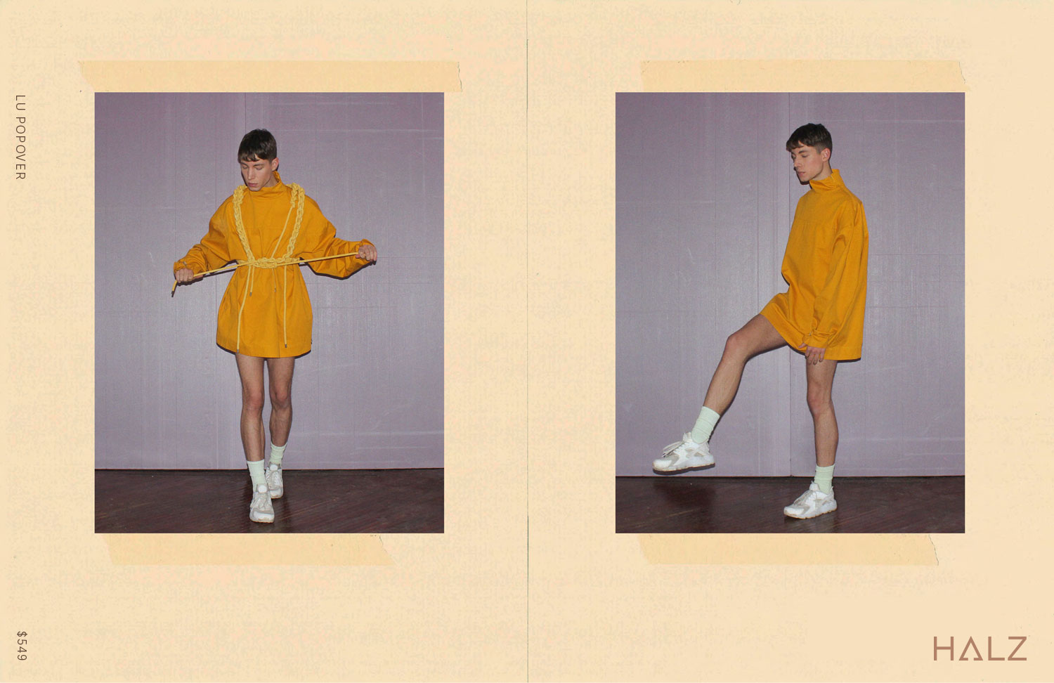
An elastic, inclusive approach
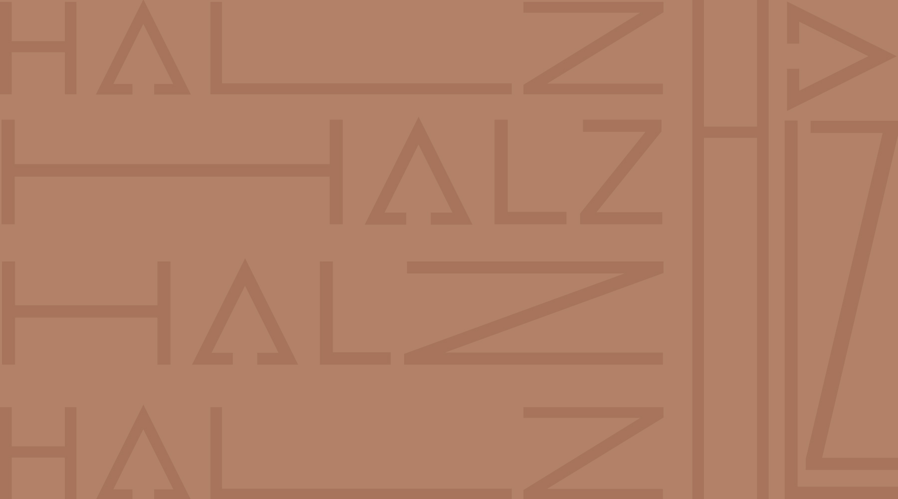
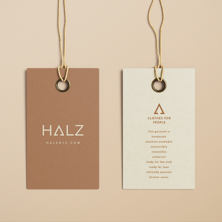
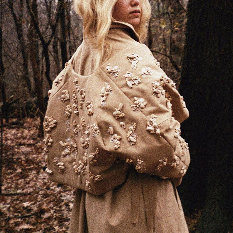
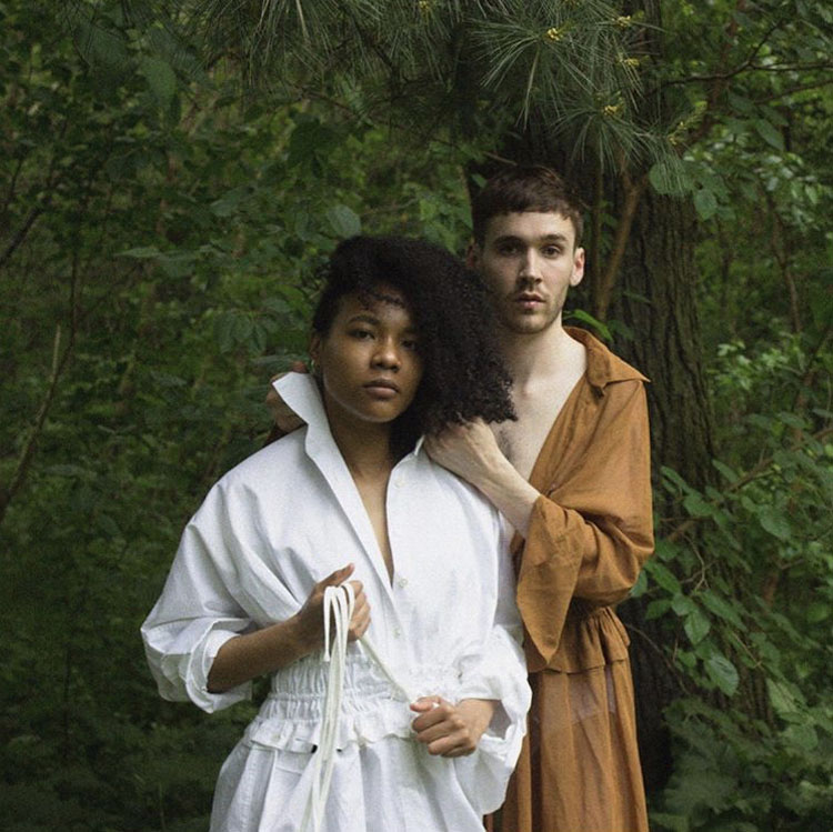
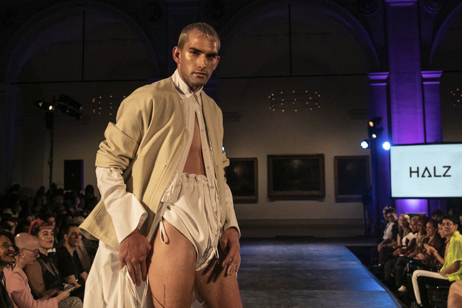
HALZ is an inclusive fashion house with handmade, wearable, high-quality pieces. The branding is rooted in elasticity and adaptability. The resolved mark is a square-based typeface with a modified “A”. The triangular “A” draws inspiration from the delta symbol for change, as well as symbols commonly seen in stretch stitches. The camel color softens the angular shapes in the mark. Alternate typography features horizontal and vertical options that mirror the flexibility of the audience and wear for HALZ pieces. These logo extensions allow the text to stretch across a variety of applications, expressing the breath of possibilities in self-expression.
Images courtesy of HALZ and the Associated Press
Strategy
Branding